



Every day people collect numbers: how long a bus ride takes, how many goals a team scores, how tall plants grow. Statistics is the science of collecting, displaying and describing data so that a pile of numbers tells a clear story. In this chapter you will learn to ask good questions, draw dot plots, histograms and box plots, and describe a data set with a center and a spread.
1. Statistical questions and variability
A statistical question is a question you expect to have many different answers in the data you collect. The differences among the answers are called variability.
“How many pets does Maya have?” has one answer, so it is not statistical. “How many pets do the students in Grade 6 have?” is statistical, because you expect 0 pets for some students, 1 for others, 3 for others, and so on. A set of answers to a statistical question is called a data set, or a distribution when we look at how the values are spread out.
A question such as “What is the tallest mountain in Colorado?” has a single answer, even though it talks about many mountains. Ask yourself: will I get different numbers if I ask different people or measure different things? If yes, it is statistical.
2. Dot plots and frequency tables
A dot plot puts one dot above a number line for every value in the data. A frequency table lists each value and how many times it occurs. Here are the numbers of siblings of 15 students:
0, 1, 1, 1, 2, 2, 2, 2, 2, 3, 3, 3, 4, 4, 6
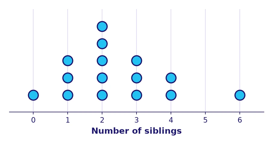
| Siblings | 0 | 1 | 2 | 3 | 4 | 6 | Total |
|---|---|---|---|---|---|---|---|
| Frequency | 1 | 3 | 5 | 3 | 2 | 1 | 15 |
The dot plot shows the shape right away: most students have 1 to 3 siblings, and the value 6 sits alone on the right. A value far from the others is called an outlier if it is unusually far away. The tallest stack, at 2, is the mode.
3. Histograms and choosing bins
When values are spread over a wide range, a dot plot becomes crowded. A histogram groups values into equal-width intervals called bins and draws a bar for each bin. The bars touch because the bins are continuous, and the height of a bar is the frequency, the number of values in the bin.
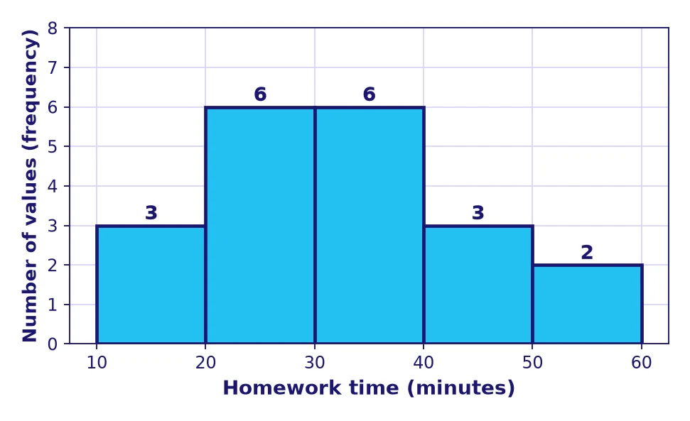
Twenty students reported their homework time. The bin 20–30 means “at least 20 and less than 30 minutes”, and it holds 6 students. A histogram shows the shape but hides the exact values.
- Find the smallest and largest values.
- Choose a bin width that gives about 4 to 8 bins (10, 5 or 2 are common).
- Make bins of equal width that do not overlap, such as 10–20, 20–30, and so on.
- Count the values in each bin; the counts must add up to the total number of values.
- Draw touching bars and label both axes.
If the bins are too wide you lose detail; if they are too narrow you get many tiny bars and cannot see the pattern.
4. The mean as a fair share and a balance point
The mean of a data set is the sum of the values divided by the number of values. It is the amount each person would get if everything were shared equally, which is why it is called the fair share.
Four friends have 3, 5, 6 and 10 trading cards. Put all the cards together: \(3+5+6+10 = 24\). Share them equally among 4 friends: \(24 \div 4 = 6\). The mean is 6 cards each.
The mean is also a balance point. Imagine the values as weights on a number line: the line balances exactly at the mean. In Example 1 the distances below 6 are \(3\) and \(1\), a total of 4; the distances above 6 are \(0\) and \(4\), a total of 4. The totals match, so the line balances at 6.
The distances from the mean to the values below it add up to the same total as the distances from the mean to the values above it.
On my planet we say: “The mean is the value where the pulling to the left equals the pulling to the right.” Check it by adding the distances on each side!
5. Median and mode
The median is the middle value when the data are in order. With an even number of values, it is the mean of the two middle values. The mode is the value that occurs most often; a data set can have one mode, several modes or none.
Quiz scores: 9, 4, 7, 10, 6, 8. In order: 4, 6, 7, 8, 9, 10. There are 6 values, so take the two middle ones, 7 and 8: \(\dfrac{7+8}{2} = 7.5\). The median is 7.5. No value repeats, so there is no mode.
For the sibling data the median is the 8th of 15 values, which is 2, and the mode is 2 as well.
6. Box plots and the five-number summary
To describe the spread of the middle of the data, split the ordered list in two halves at the median. The median of the lower half is the first quartile \(Q_1\); the median of the upper half is the third quartile \(Q_3\). When the number of values is odd, leave the middle value out of both halves. The five-number summary is: minimum, \(Q_1\), median, \(Q_3\), maximum.
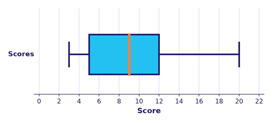
A box plot draws the box from \(Q_1\) to \(Q_3\), a line at the median, and “whiskers” out to the minimum and maximum. Each of the four parts (left whisker, left half of the box, right half of the box, right whisker) holds about one quarter of the values, so the box contains about half of the data.
7. Range, IQR and mean absolute deviation
Range = maximum − minimum. Interquartile range (IQR) = \(Q_3 - Q_1\). Mean absolute deviation (MAD) = the mean of the distances between each value and the mean.
Scores in order: 3, 5, 5, 6, 8, 9, 10, 12, 12, 14, 20 (11 values). The median is the 6th value, 9. Lower half: 3, 5, 5, 6, 8, so \(Q_1 = 5\). Upper half: 10, 12, 12, 14, 20, so \(Q_3 = 12\). The summary is 3, 5, 9, 12, 20. Range: \(20 - 3 = 17\). IQR: \(12 - 5 = 7\).
Data: 4, 6, 6, 8, 11. The mean is \(35 \div 5 = 7\). Distances from 7: 3, 1, 1, 1, 4. Their sum is 10, so \(\text{MAD} = 10 \div 5 = 2\). On average, the values are 2 units from the mean.
- Find the mean.
- Find the distance from each value to the mean (always positive).
- Add the distances and divide by the number of values.
8. Choosing measures and describing the shape
A good description of a distribution gives its center, its spread, its shape and any outliers. The shape can be roughly symmetric (balanced on both sides), skewed right (a long tail toward large values) or skewed left (a long tail toward small values).
- If the data are fairly symmetric with no outliers, use the mean and the MAD.
- If the data are skewed or have an outlier, use the median and the IQR, because they are not pulled by extreme values.
An outlier drags the mean toward it. Compare the data 5, 6, 7, 8, 9 (mean 7) with 5, 6, 7, 8, 29 (mean 11): one large value moved the mean by 4, while the median stayed at 7.
Also report the units and the number of values, for example: “20 students, median 31.5 minutes, IQR 15.5 minutes, skewed right.”
Key takeaways
- A statistical question expects different answers; the differences are called variability.
- Dot plots and frequency tables show every value; histograms group values in equal bins.
- Mean = sum \(\div\) number of values: the fair share and the balance point.
- Median = middle value of the ordered data; mode = most frequent value.
- Five-number summary: minimum, \(Q_1\), median, \(Q_3\), maximum, shown in a box plot.
- Range = max − min; IQR = \(Q_3 - Q_1\); MAD = mean distance from the mean.
- For skewed data or outliers, prefer the median and the IQR.


Test yourself: quick challenge for Grade 6
Speed drill for Grade 6: how many in 60 seconds?
🚀 Keep exploring with Zyro
 ✏️ Math practiceStatistics and Data Displays: math practice, Grade 6
 📝 Math testsStatistics and Data Displays: math test, Grade 6
 🎯 Math quizzesStatistics and Data Displays: math quiz, Grade 6
 ✏️ Math practicePercents: math practice, Grade 6
 ✏️ Math practiceDividing Fractions: math practice, Grade 6
 📝 Math testsPercents: math test, Grade 6